
Highlights
A major US furniture e-commerce retailer struggled with checkout abandonment caused by complex T&C presentation. By strategically optimizing their legal content design and placement, we achieved a 7.4% revenue per user increase and 2% higher conversion rates while maintaining full compliance.
The Challenge
Bulky T&C placement in checkout created unnecessary friction, particularly impacting mobile users. By optimizing the legal content’s presentation and placement, we maintained compliance while streamlining the purchase flow.
Our Solution 💡
Instead of overwhelming users with legal text at the final stage of purchase, we developed a clean, simple approach that maintained compliance while reducing friction.
- Created a compact, less intimidating format
- Added a modal popup for full terms access
- Maintained all legal requirements while reducing friction
Technical Implementation ⚡
The team deployed changes through our testing tool, Nantu, which allowed us to modify the DOM elements for T&C relocation, implement responsive styling across devices, and set up comprehensive event tracking.
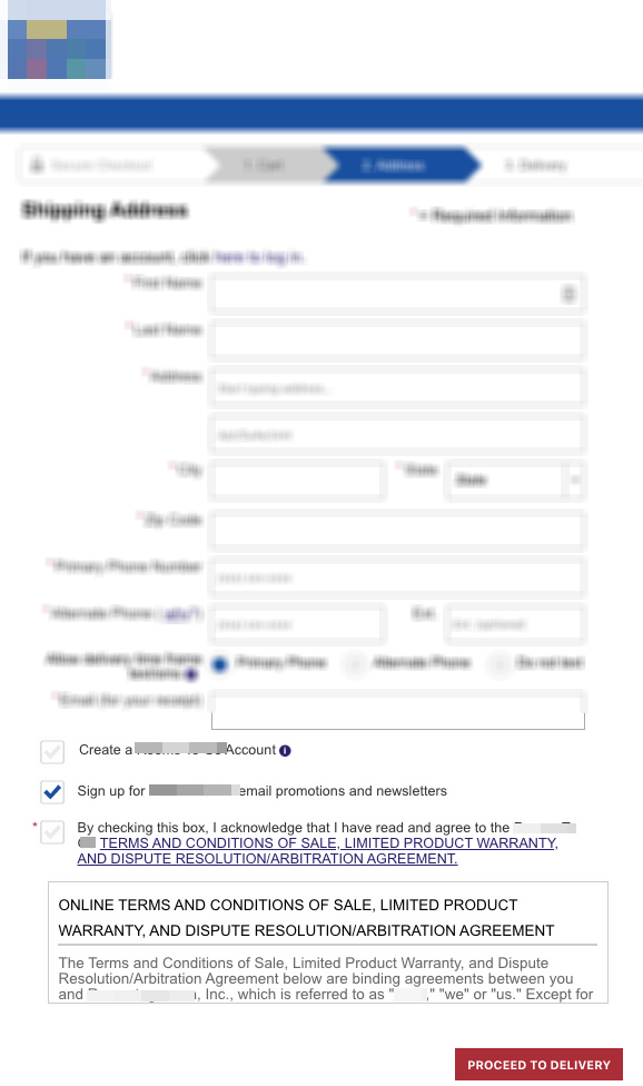
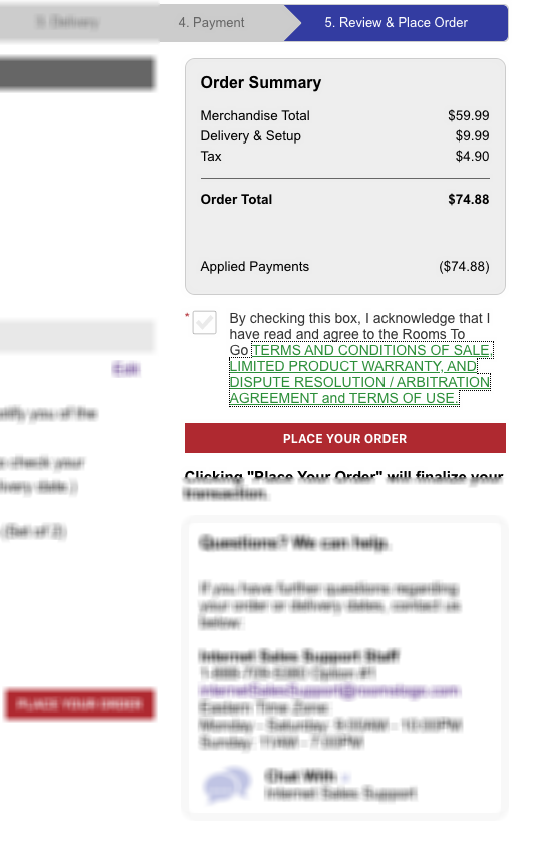
The key changes to the page focused on three essential improvements: we removed the bulky T&C block from the shipping page and relocated it to the review page in a condensed format, implemented a clean scrollable container with a “View Terms” modal trigger, and preserved the acceptance checkbox while matching the existing visual style.
- Modified the DOM elements to relocate T&C content
- Added a modal popup trigger for viewing full terms
- Implemented responsive styling for all device types
The Results 🎯
Results Table:
| Metric | Control | Variation | Lift |
|---|---|---|---|
| Users | 3,235 | 3,246 | - |
| Transactions | 476 | 511 | 7.0% |
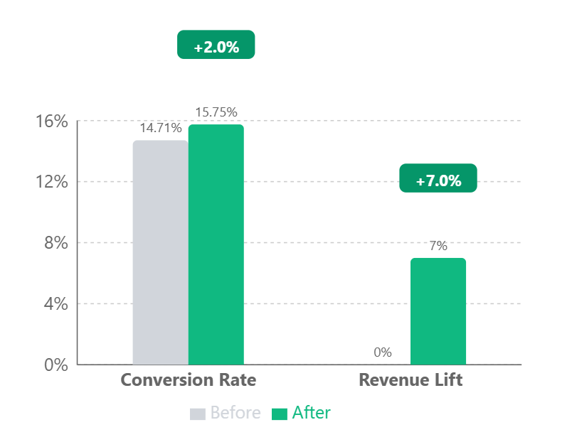
| Conversion Rate | 14.71% | 15.75% | 2.0% |
| Revenue Lift | - | - | 7.4% |
Why It Worked 🎯
The test results confirm a fundamental principle of checkout optimization: reducing perceived risk improves conversion rates. Here’s what we learned:
- Legal text creates anxiety - when users see a wall of fine print, they instinctively become more cautious about proceeding
- Moving terms to a modal reduced the visual “weight” of legal content while maintaining access to important information
- The streamlined design built trust by being transparent yet unobtrusive
- Mobile users were particularly responsive since the new design eliminated intimidating blocks of small text on small screens
The dramatic improvement in both conversion rate and revenue validates that how you present legal requirements matters as much as what you present. By making terms and conditions feel less threatening while keeping them fully accessible, we helped users focus on completing their purchase rather than worrying about hidden gotchas. One thing worth flagging: the 14.71% base here is a checkout-stage rate, not a sitewide one - our stats page breaks out how conversion rates climb by funnel stage, which is why trimming friction at the final steps pays off in revenue.
Let’s Talk 💬
Want to find hidden revenue in your checkout process? Let’s analyze your funnel and identify quick wins that could boost your bottom line.
Appendix: Detailed Test Parameters and Statistical Analysis
Technical Test Parameters
| Parameter | Value |
|---|---|
| Device Targeting | All devices |
| Browser Targeting | All major browsers |
| User Segments | All traffic |
| Page Scope | Checkout shipping and review pages |
| Test Duration | 30 days |
Statistical Analysis
| Metric | Value |
|---|---|
| Confidence Level | 95% |
| Z-score | 1.96 |
| P-value | 0.049 |
| Conservative Lift Estimate | 0.5% |
| Sample Size | 6,481 users |
| Participation Rate | 100% |
Checkout legal copy goes untested almost everywhere, but a thorough CRO agency gets to it - optimizing it added 7.4% revenue per user for this furniture retailer.