
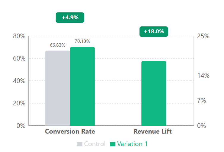
A simplified checkout header increased conversion rates by 4.9% and boosted revenue by 18% for a leading gift card retailer. This test generated $8.27M in projected annual revenue through minimal design changes.
Highlights
We tested three simplified header designs in the checkout against the original, finding that the cleanest version with just a logo and text sign-in link delivered the best results. This approach eliminated distractions while preserving essential functionality.
Checkout-header simplification works because every UI element on a checkout page competes with the buy button - 18% revenue lift here. Removing the elements that compete with the buy button is exactly the discipline ecommerce teams should test for when they shortlist the best ecommerce conversion rate optimization agencies.
- 4.9% increase in checkout conversion rate (from 66.83% to 70.13%)
- 18% revenue lift
The test proved that reducing distractions at the critical conversion moment significantly impacts purchasing behavior.
The Challenge
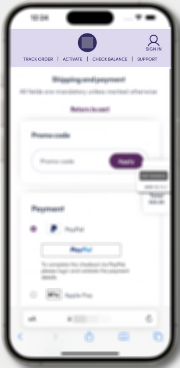
The client’s checkout page featured a header with a couple navigation options that were creating unnecessary friction and distracting users from completing their purchases.
Analysis of user behavior confirmed our suspicion - these header elements were pulling customers away from the checkout flow, resulting in more abandoned carts.
Our Solution 💡
Our strategy involved creating three variations with different levels of header simplification:
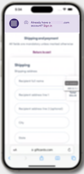
- Variation 1: Ultra-simplified header with only the logo and “Sign In” text link
- Variation 2: Header with sign-in statement plus essential navigation links
- Variation 3: Header with sign-in icon and additional navigation options
Each variation maintained consistent styling with the rest of the site while removing different levels of distracting elements.
Technical Implementation ⚡
We deployed our test using client-side JavaScript modifications that allowed us to:
- Target all users reaching the checkout billing page
- Split traffic equally between control and three variations
- Collect data across all devices and browsers
The Results
| Metric | Control | Variation 1 | Lift |
|---|---|---|---|
| Users | 14,748 | 15,093 | - |
| Transactions | 9,856 | 10,585 | - |
| Conversion Rate | 66.83% | 70.13% | 4.9% |
| Revenue Lift | - | - | 18% |
Why It Worked 🎯
Our test confirmed a fundamental principle of conversion optimization: reducing cognitive load directly increases conversion rates. The psychology behind our success is straightforward—by removing unnecessary choices, we enhanced decision-making efficiency at the critical conversion moment.
These results align with established CRO patterns: reduced distractions lead to increased focus on completing purchases; minimizing choices improves decision-making efficiency; maintaining only essential functionality supports the checkout process; and clear text labels outperform symbolic representations. For e-commerce businesses, implementing these principles can dramatically improve conversion rates. The 66.83% base is a reminder that a conversion rate means little without context - this is a billing-page number, not a sitewide one, and our conversion rate benchmarks show how dramatically the figure shifts depending on where in the funnel it’s measured.
Let’s Talk 💬
Ready to uncover conversion killers lurking in your checkout process? Our methodical testing approach can identify exactly where you’re leaving money on the table.
Book a free conversion analysis call today and we’ll show you how simple changes can drive significant revenue growth.
Appendix: Detailed Test Parameters and Statistical Analysis
| Test Parameters | Details |
|---|---|
| Device targeting | All devices (desktop, tablet, mobile) |
| Browser targeting | All browsers |
| User segments | All users reaching the checkout billing page |
| Page scope | Checkout billing page |
| Traffic allocation | Equal split between control and three variations |
| Statistical Analysis | Results |
|---|---|
| Confidence level | 99% |
| Z-score | 6.14 |
| P-value | 0.0000 |
| Conservative lift estimate | 4.4% |
| Sample size | 29,841 combined users |
| Test duration | 22 days |
| Participation rate | 100% |