
Learn how we increased a national furniture retailer's app download conversions by 18.8% and boosted revenue by 23.4% with a simple UX change. By moving their promotional shadowbox from the bottom to the top of the screen, we aligned with natural user scanning patterns for desktop visitors. See our complete methodology, implementation details, and statistical analysis in this case study.
Highlights
We identified that the shadowbox’s bottom position competed with natural user scrolling patterns. By implementing a top-positioned variant, we created a more intuitive user experience that delivered immediate results.
Key achievements:
- Conversion rate increased from 0.55% to 0.65% (18.8% lift)
- Improved revenue per user by 23.2%
The Challenge
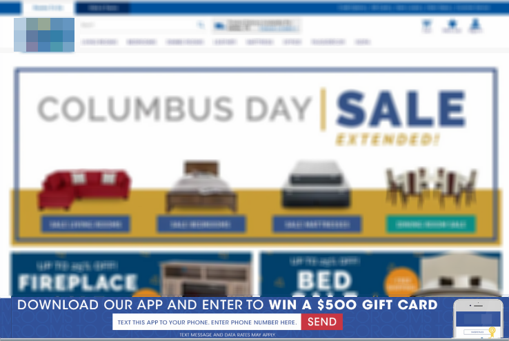
The client’s desktop app promotion wasn’t performing as expected. Their existing shadowbox popup, appearing from the bottom of the screen, was getting ignored.
Our Solution 💡
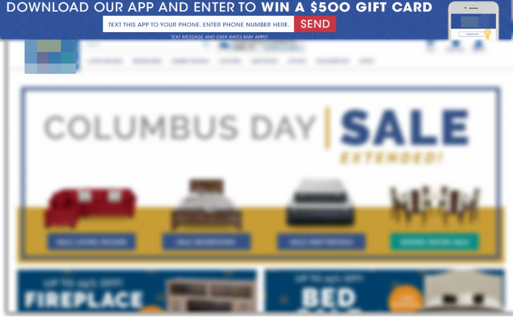
We proposed a simple change: move the promotion shadowbox from the bottom to the top of the screen. Our hypothesis? This would create a more natural, less disruptive user experience that would drive better results.
Here’s what we implemented:
- Top-positioned shadowbox with smooth sliding animation
- Maintained existing promotional content
- Enhanced phone number validation for multiple formats
- Added full accessibility features including ARIA labels
Technical Implementation ⚡
Understanding that simplicity often drives the best results, we designed our test implementation to isolate the impact of the shadowbox position change on desktop:
- Desktop-only test
- 50/50 traffic split
The Results
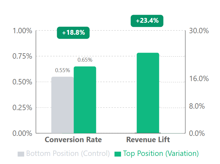
Moving our app download promotion from bottom to top of page drove substantial improvements across key metrics. The conversion rate increased from 0.55% to 0.65%, representing an 18.8% lift (p < 0.05). This optimization also generated a 23.4% increase in revenue.
Reality Check
That was a huge increase, and frankly not really believable as a long-term outcome. While we were excited about these initial results, we advised the client that these two-week numbers were likely on the high side. Test periods can sometimes show amplified outcomes compared to long-term performance. The key takeaway was that we had statistical confidence the top placement outperformed the bottom placement. Getting more precise long-term estimates would have required extending the test, but with such clear positive signals, the opportunity cost of delaying rollout wasn’t justified. We recommended moving forward with the winning variation to start capturing value immediately. The 0.55% the promotion started from is also a useful sanity check - our realistic conversion rate benchmarks show that a sub-1% base is normal for high-ticket furniture, so an 18.8% relative lift is real money even when the two-week figure overstates it.
Result Table:
| Metric | Control (Bottom) | Variation (Top) | Lift |
|---|---|---|---|
| Users | 53,139 | 53,162 | - |
| Transactions | 291 | 346 | 18.8% |
| Conversion Rate | 0.55% | 0.65% | 18.8% |
| Revenue Lift | - | - | 23.4% |
Why It Worked 🎯
Moving the promotion to the top of the page worked by tapping into two fundamental aspects of user behavior and design:
Natural Scanning Patterns: Desktop users typically scan from top to bottom, starting in the upper left corner. By moving our promotion to match this natural eye movement, we caught users’ attention before they began scrolling. The results suggest this created a “can’t miss” moment at the start of their page interaction.
Clean User Experience: The bottom of the page can get crowded with navigation, footers, and other promotional content. Moving our offer to the top eliminated this competition and gave it room to breathe. Users could focus on one clear call-to-action without distraction.
Let’s Talk 💬
Ready to uncover hidden conversion opportunities in your e-commerce site? Let’s analyze your user experience and find your next big win. Get in touch for a data-driven consultation.
Appendix: Detailed Test Parameters and Statistical Analysis
Test Parameters
| Parameter | Value |
|---|---|
| Device targeting | Desktop only |
| Traffic allocation | 50/50 split |
| Page scope | Sitewide implementation |
| Primary KPI | Conversion rate |
| Secondary KPIs | Revenue per user, total transactions |
| Test duration | 14 days |
| Sample size | 106,301 total users |
Statistical Analysis
| Metric | Value |
|---|---|
| Confidence level | 99% |
| Z-score | -2.18 |
| P-value | 0.0146157 |
| Conservative lift estimate | 12% |
We run small-element tests by default as this client’s CRO agency; moving one CTA above the fold lifted conversions 18.8%.