
A premium women's health center sought to improve patient acquisition through their website. Through strategic form optimization and A/B testing, we transformed their underperforming contact form (2.17% conversion rate) into a 29.7% more effective patient acquisition tool.
Highlights
Through comprehensive form optimization focused on trust signals, user experience, and mobile responsiveness, we conducted strategic A/B testing over 45 days to transform their digital patient acquisition process.
Healthcare form optimization - balancing trust signals, mobile UX, and minimum-required-field discipline - drove a 30% patient-signup lift here. Regulated-vertical test rigor at the level of a senior conversion rate optimization agency with documented healthcare track record.
Key achievements:
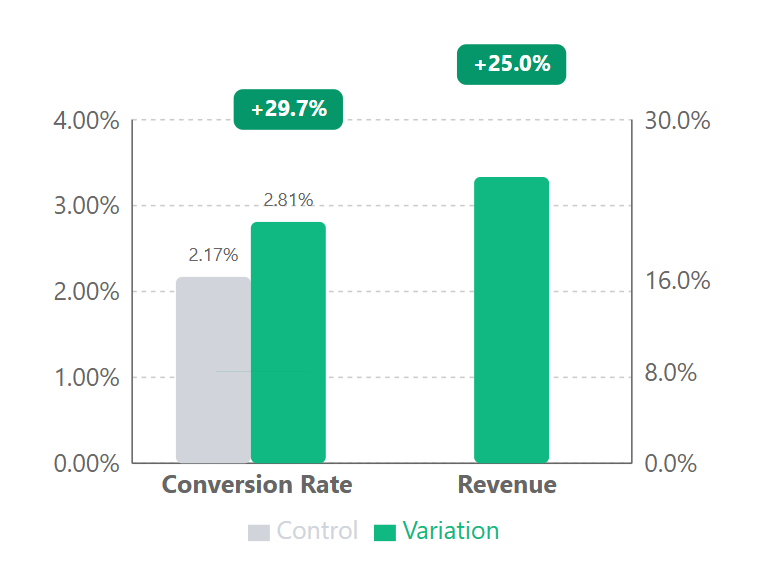
- Conversion rate jumped from 2.17% to 2.81% (29.7% increase)
- Average revenue per patient increased by 30%.
The Challenge
When we analyzed their conversion funnel, we discovered a critical bottleneck. Despite having quality traffic and excellent services, their contact form was creating friction in the patient acquisition process. The clinical design and poor user experience were preventing potential patients from taking the first step.
Their contact form was the primary channel for new patient acquisition, but it wasn’t performing:
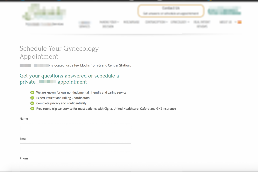
- Clinical, impersonal design
- Lack of trust signals
- Poor visual hierarchy
Our Solution
After diving deep into user behavior data and healthcare conversion principles, we developed a hypothesis: creating a more welcoming, trust-focused experience would significantly impact form completions. Here’s exactly what we implemented:
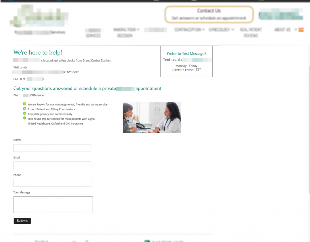
- Added a welcoming “We’re Here To Help” header
- Integrated professional medical imagery
- Enhanced typography and spacing
Our approach centered on reducing patient anxiety during the initial contact process. Women’s healthcare involves deeply personal concerns, and our research showed that creating psychological safety through design was critical. By transforming the clinical feel into a more empathetic experience, we aimed to mirror the actual care patients would receive at the center – professional yet compassionate.
Technical Implementation
To ensure accurate results and maximum impact, we set up a thorough A/B testing environment with specific parameters to measure our optimization efforts:
- All devices and modern browsers
- First-time visitors only
- 45-day test duration
The implementation followed statistical best practices for healthcare marketing, incorporating the higher conversion threshold standards required in medical contexts. Rather than using rapid testing with minimal sample sizes, we prioritized longer-term analysis to account for weekly fluctuations in healthcare inquiry patterns. This approach ensured our results were not just statistically valid but also reflected the complex decision-making journey prospective patients undergo when seeking specialized care.
The Results
Results Table:
| Metric | Control | Variation | Lift |
|---|---|---|---|
| Users | 2,583 | 2,490 | - |
| Conversions | 56 | 70 | 29.7% |
| Conversion Rate | 2.17% | 2.81% | 29.7% |
| Revenue Lift | - | - | 25.% |
🎯 Why It Worked
Our data showed three key success factors:
- Trust Signals Matter: The professional imagery and welcoming messaging created immediate credibility with potential patients.
- User Experience Drives Conversions: Better spacing and typography reduced cognitive load, making the form less intimidating to complete.
- Mobile-First Thinking: Our responsive design ensured performance across all devices, capturing users wherever they browsed.
For a healthcare lead form, a 2.17% base is about what you’d expect - our stats show where lead-gen and healthcare conversion rates typically fall, a very different range from the ecommerce numbers most benchmarks lead with.
Let’s Talk 💬
Running a healthcare practice? We’d love to show you how we can optimize your patient acquisition funnel. Book a call to discuss your conversion goals.
Appendix: Detailed test parameters and statistical analysis
Test Parameters
| Parameter | Value |
|---|---|
| Device targeting | All devices |
| Browser targeting | All modern browsers (IE 11+, Chrome, Firefox, Safari) |
| User segments | New visitors |
| Page scope | Contact form page |
| Duration | 45 days |
| Participation rate | 100% |
Statistical Analysis
| Metric | Value |
|---|---|
| Confidence level | 95% |
| Standard Error | 0.00286556 |
| Z-score | 2.1 |
| P-value | 0.049 |
| Conservative lift estimate | 14% |
| Sample size | 5,073 |