
Transforming a gift card retailer's navigation dropdown yielded impressive results: 5.2% conversion rate increase and $3.7M additional annual revenue. Our testing revealed that the simpler two-column layout dramatically improved user engagement and purchase behavior. This case study demonstrates how intelligent navigation design directly impacts e-commerce profitability through reduced cognitive load and improved user experience.
Highlights
This enterprise gift card retailer struggled with a complicated navigation menu that created unnecessary friction in the customer journey, particularly affecting their high-value Visa gift card category.
Our team designed and tested two streamlined navigation variations with improved visual hierarchy and clearer categorization, ultimately implementing a two-column layout that significantly enhanced user engagement and purchase behavior.
- Conversion rate improved from 4.27% to 4.49% (5.2% lift)
- Statistical significance achieved at 96% confidence level
- Projected annual revenue impact of $3.7 million
The Challenge
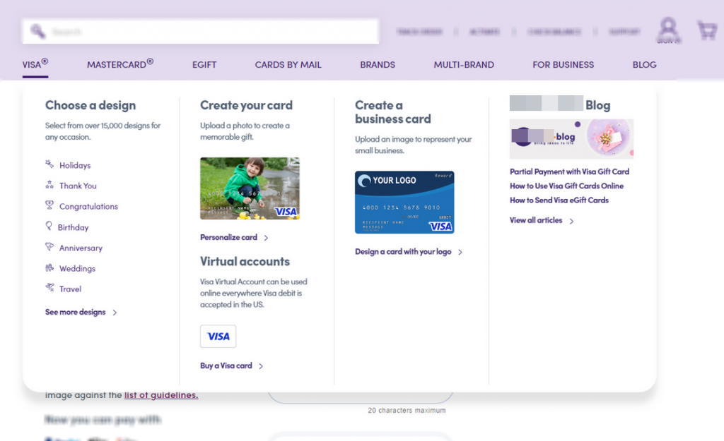
Their original Visa dropdown navigation lacked visual structure and clear categorization, creating significant friction in the user journey. This poor navigation experience:
- Made it difficult for users to find specific Visa gift card products
- Created unnecessary cognitive load during product discovery
- Didn’t focus on the highest converting, most profitable products
Internal data had already identified Visa gift cards as a high-value product category with visitors showing higher-than-average purchase intent. The navigation simply wasn’t optimized to capitalize on this opportunity.
Our Solution 💡
We developed two enhanced navigation variations with a clear hypothesis: restructuring the Visa dropdown with a clearer, more visually appealing layout would improve user engagement and increase purchases.
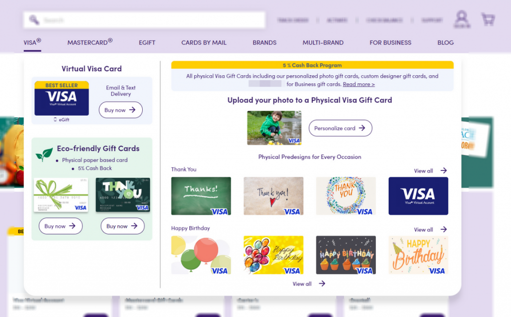
Our winning approach (Variation 2: Two-Column Design):
- Streamlined content into two balanced columns
- Added appealing card imagery and colorful category sections
- Created a more compact, focused presentation
We also tested a Three-Column Design that showed modest improvements but didn’t match the performance of our winning variation.
Technical Implementation ⚡️
Our process was methodical and precise. We updated the HTML/CSS structure to create the new dropdown design while implementing responsive layouts that worked seamlessly across all desktop screen sizes. The team added custom styling for interactive elements like hover states and ensured consistent branding throughout.
We also created fallback styling for browsers below 1175px width and maintained performance by optimizing image assets. To measure effectiveness, we implemented analytics tracking for detailed interaction data. The test targeted desktop users on all major browsers, included all site visitors, and was applied to the global navigation present on all pages for a duration of 21 days.
The Results
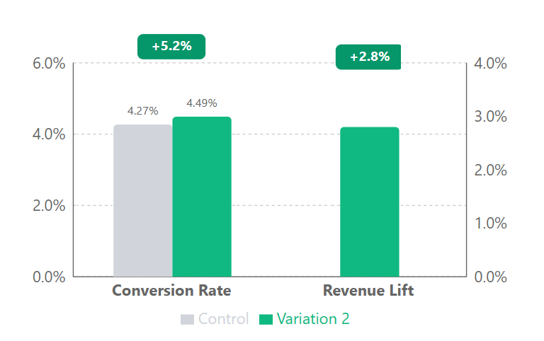
We tested two variations, with the Two-Column Design (Variation 2) emerging as the clear winner. While the Three-Column Design (Variation 1) showed some improvements with a 4.9% conversion rate lift, the simpler Two-Column approach delivered superior results across all metrics:
| Metric | Control | Variation 2 (Winner) | Lift |
|---|---|---|---|
| Users | 52,270 | 53,372 | - |
| Transactions | 2,358 | 2,396 | - |
| Conversion Rate | 4.27% | 4.49% | 5.2% |
| Revenue | - | - | 2.8% |
Small Wins Matter
While a 5.2% conversion improvement might not sound dramatic, these are exactly the kind of results we love to see. Our philosophy is built on accumulating many small, reliable wins rather than chasing huge, risky changes. When you stack these modest gains over time, they add up to significant improvements in your bottom line. It’s the difference between sustainable growth and gambling on home runs.
This test perfectly illustrates why we prioritize incremental optimization - a simple navigation redesign with minimal development cost generated an additional $3.7M in annual revenue. These “small” wins are actually massive when measured against the resources invested. The 4.27% the site started from is a fairly ordinary ecommerce baseline, which is exactly why a 5.2% relative lift compounds into $3.7M - our breakdown of typical ecommerce conversion rates shows where that starting point falls.
Why It Worked 🎯
Our test revealed powerful conversion principles at work. The simpler two-column layout outperformed the more complex design because it reduced cognitive load – a fundamental CRO principle that states users make decisions more easily when presented with fewer, better-organized options.
The improved visual hierarchy created a clear conversion path, allowing users to quickly identify relevant Visa gift card options without friction, directly aligning with the preference-construction principle that users build product preferences during their shopping journey.
Most importantly, we observed a 6.5% increase in revenue per user, demonstrating the scent-of-information principle in action – users who can efficiently navigate to products they value are more likely to convert and spend more, as they perceive the site as more trustworthy and intuitive.
Let’s Talk 💬
Our process-driven approach to CRO consistently delivers significant results for e-commerce businesses. Let’s discuss how we can apply these same principles to improve your site’s performance.
Appendix: Detailed Test Parameters and Statistical Analysis
Test Parameters
| Parameter | Setting |
|---|---|
| Device Targeting | Desktop users only |
| Browser Targeting | All major browsers |
| User Segments | All site visitors |
| Page Scope | Global navigation present on all pages |
| Test Duration | 21 days |
| Participation Rate | Approximately 60% |
Statistical Analysis (Winning Variation)
| Metric | Value |
|---|---|
| Confidence level | 96% |
| Z-score | 1.79 |
| P-value | 0.0363 |
| Conservative lift estimate | 3.1% |
| Sample size | 53,372 |
| Test duration | 21 days |
| Participation rate | Approximately 60% |
A good CRO agency cuts friction where it costs most - simplifying this enterprise client’s navigation at the point of purchase projected a $3.7M annual lift.