
Want to improve user experience on your ecommerce website? Check out these 7 proven and tested techniques to improve UX
Mathew Dixon, Karen Freeman, and Nick Toman said in their article in HBR that:
“Delighting customers doesn’t build loyalty; reducing their effort — the work they must do to get their problem solved — does.”
One of the best ways to gain a competitive advantage for your ecommerce business is to improve user experience (UX). If you serve your ideal customers better, you will win more business. Leading businesses around the globe are investing heavily in UX because it has a significant impact on business growth and revenue.
A Forrester study found that every $1 invested in UX results returns up to $100 and increases the conversion rate by a whopping 400 percent. Econsultancy reported that 74 percent of businesses are of the view that UX is the key to increasing sales.
You can’t ignore these numbers, right?
However, a lot of ecommerce businesses fail to prioritize user experience and rather spend too many resources on site design. While visual appearance does play a role initially in grabbing visitor attention, user experience keeps them hooked.
The good news is that there’s no need to reinvent the wheel. You need to stick with the scientifically proven best practices to improve the user experience in your ecommerce store. Below is a list of the seven best and proven ways to enhance user experience for better ROI, conversions, customer loyalty, and revenue:
- Responsive design;
- Site load speed;
- Functionality over design;
- Simplified checkout process;
- Skimmable product descriptions;
- Product recommendations;
- Form optimization.
1. Responsive Design
Your ecommerce store must have a responsive design because mobile retail ecommerce sales in the U.S. should pass $710 billion by 2025 and account for 44 percent of retail commerce. This means your store must work seamlessly across all devices.
As of July 2022, a whopping 92.1 percent of global internet users access the internet via mobile phones:
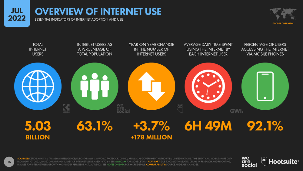
This shows why a responsive ecommerce design is essential so your ideal customers can access your store on mobile devices. A non-responsive ecommerce store design kills UX.
A Google study found that 50 percent of people say they won’t shop from a brand having a poorly designed mobile store and 59 percent of shoppers say that the ability to buy on a mobile device plays a crucial role when deciding on an online retailer.
Having a responsive website design is the first step toward improving your retail store’s UX.
How to Do It
The first step is checking the current status of your website or app and analyzing how it loads on different devices. Use a free tool like Screenfly to view your website for different screen sizes.
Here is how to address issues:
- If you are using a custom design, it will require input from your designers and developers. Ideally, you should focus on responsive design from day one if you are developing a store from scratch.
- If you don’t have a custom-designed ecommerce website, you can switch to a responsive theme or template based on your CMS. This is relatively easier and doesn’t require technical expertise.
You need to inspect your site’s responsiveness regularly. As you add more products, images, landing pages, and content, it might lead to minor (or even major) issues related to design and responsiveness. Regularly auditing once or twice a year is exceptionally helpful.
2. Site Load Speed
Optimizing website load speed is one of the best ways to improve the user experience of your ecommerce store. A slow website is a source of frustration for visitors.
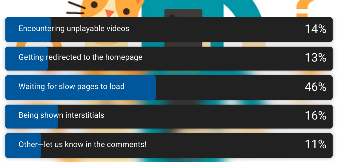
People hate waiting for a website to load. As much as 46 percent of people said that waiting for a slow page to load is what they dislike the most on their mobile devices:
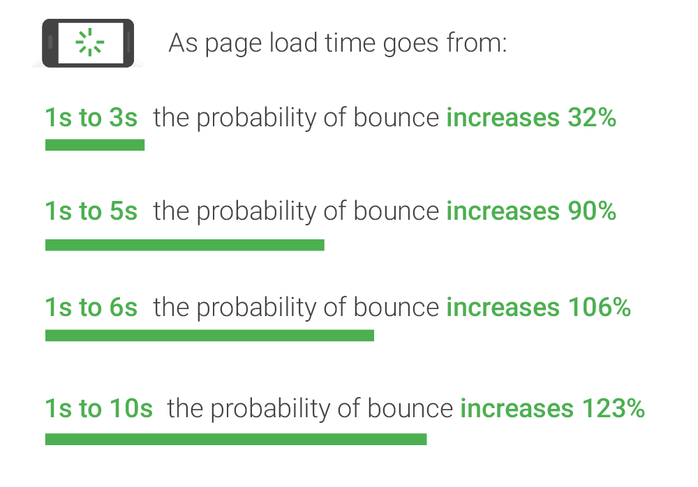
Slow website speed doesn’t just ruin UX, but it leads to customer and conversion loss. Statistics show that website load time is directly related to bounce rate:
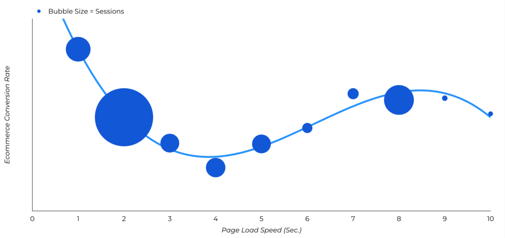
Another study found that the highest ecommerce conversion rate happens on pages that load between 0 and 2 seconds:
If you have a slow website, your target audience will only add to the bounce rate that will negatively impact your website position in SERPs, and there isn’t much you can do except make your store super-fast. This is the best gift you can give your ideal customers because they crave fast websites.
Nobody likes waiting for a website to load, especially when there are a whole lot of other options available to choose from. Your target audience will switch to your competitor and won’t waste time waiting with your slow website.
How to Increase Page Speed?
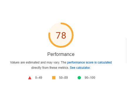
Thanks to Google PageSpeed Insights, you can inspect your site load time and identify issues in a few seconds. It shows you load speed for mobile and desktop and gives suggestions on how to fix issues and improve page speed.
Here is what the output looks like:
You will find a list of recommendations in the form of opportunities:
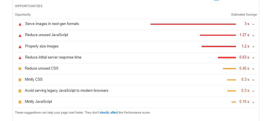
Most of these are easy fixes. Your design and development team can take care of other problems. Here is a quick checklist to increase the speed of your ecommerce site and improve user experience:
- Compress and optimize product images;
- Use website caching;
- Minify HTML, JavaScript, and CSS files;
- Use content delivery network;
- Switch to a better and faster hosting company;
- Remove unwanted files, directories, scripts, and plugins;
- Use the speed optimization plugin.
Insights from the field - Page Speed:
Page speed is one of the toughest nuts to crack.
At Conversion Team, we tell our clients that an average, unoptimized Google page speed score for mobile ecommerce is 20 (out of 100). We help optimize page speed as part of our Iterate program, and our goal is to get the score to 60. In most cases, 60 is a fine stopping point and already represents a competitive advantage over the competition. Getting from 60 to 100 is a huge lift, which is generally not worth it.
Note: Achieving high desktop scores is easier. A score of 90+ is not uncommon.
3. Improve Functionality Instead of Design
The idea behind user experience is to help visitors achieve what they want without any distractions. If visitors can’t get what they want on your site, you need to improve your website’s functionality that will lead to better user experience.
Website functionality is the ease with which website visitors can navigate, find products, purchase products, check out, and perform other tasks, as needed. Functionality should be your store’s top priority since it is the most important component of user experience.
Forget design, focus on functionality.
Here is a list of the top reasons for not converting, and all of these relate to functionality:
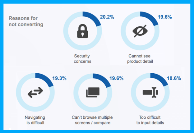
As much as 61.5 percent of people reported in a survey that they will leave a website due to bad navigation and 34.6 percent of people said they will leave a site due to poor content structure.
You need to seriously think about making your ecommerce website easy to use instead of merely visually appealing.
How to Do It
Optimizing website functionality requires input from design and development teams. It’s the way your site functions, and it requires some high level of optimization (e.g., A/B testing).
Here is a website functionality checklist that will help you get things straight quickly:
- Improve navigation and site structure;
- Optimize product pages;
- Keeps forms short and easy to fill;
- Use white space for visual cues and to drive visitors to the right place;
- Fix 404 pages;
- Simplify checkout process;
- Make calls to action prominent;
- Offer one-click payments.
Insights from the Field - Function Over Form
If you ask five people how to make a website more functional, you’ll probably get 5 pretty different answers. Function is not as objective as it seems, which is why the only good way to improve site functionality is A/B testing — a process that reveals the best functionality for your site’s specific average user.
4. Simplify Checkout Process
Research shows that 27 percent of customers abandon their carts during the checkout process due to the process being too long or complicated. Simplifying your store’s checkout process has two key benefits:
- It improves user experience because you’re removing barriers.
- It increases sales and revenue.
Make the checkout process sweet, simple, and fun so potential buyers don’t have to abandon their carts. Making the checkout process simple and offering guest checkout (where customers don’t have to create an account) are the best ways to improve the UX checkout process.
Here is an example of a guest checkout that lets customers create an account after checkout:
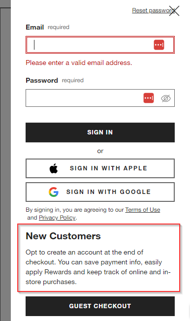
This is a perfect example of how to address user experience issues. A simple tweak in your website functionality can significantly improve user experience, conversions, and sales.
The other issue with the checkout process that ruins user experience is its length. The steps involved in the checkout process need to be minimized. A single-page express checkout works best for simple checkouts; it’s fast, unambiguous, user-friendly, and transparent.
Here is a traditional checkout process:
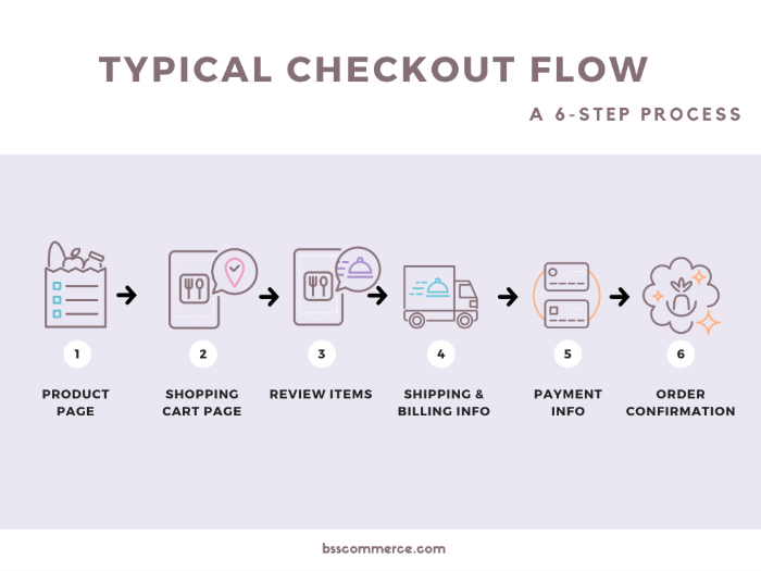
It has six steps, and each step is a different page that loads in the browser (this adds more frustration as customers don’t like to wait).
Now compare this with a simplified version of a checkout page that clearly indicates the steps involved:
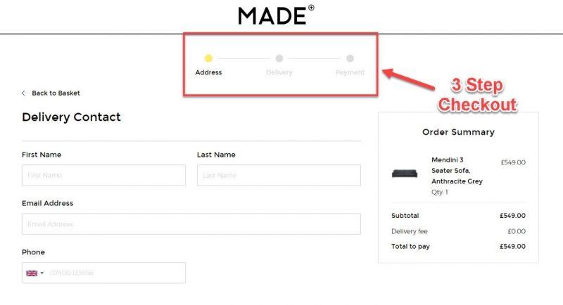
Much better, right?
A study revealed that single-page checkout improves sales by a whopping 21.8 percent as compared to the multi-step checkout process.
Here is an even better checkout process example from Amazon that allows one-click checkout:

One-click checkout works for existing customers only who have already created an account. New customers still need to create an account, so a single-page checkout process coupled with a 1-click process is best for improving user experience.
How to Do It
Switching from a multi-step checkout process to a single page is a lengthy process and isn’t the only solution to simplifying your checkout process. Here are other best practices to improve user experience by optimizing the checkout method:
- Skip registration and let customers checkout without creating an account;
- Offer the “Buy Now” option on the product page for immediate checkout;
- Show checkout steps at the top of the page;
- Keep the checkout process simple and short. Remove barriers and distractions;
- Use visual cues to guide customers throughout the checkout process.
Insights from the Field - Single vs Multi-Step Checkout
While simple one-page checkouts do tend to outperform, there are cases where a multi-step checkout will convert better. For complicated checkouts with multiple options and accessories or any other type of complexity, multi-step checkouts can be better. This is why we always test checkout steps for clients with a more complicated product offering.
5. Make Product Descriptions Skimmable
People don’t read content on the internet.
Research shows that 81 percent of people skim content online and an average internet user only reads 20 to 28 percent of words during a visit. Another study found that 55 percent of visitors read content for 15 seconds or less.
Write product descriptions that are skimmable, easy to read, and concise. This significantly boosts user experience since you’re helping your customers in reading and comprehending product descriptions.
Writing chunks of data with poor formatting and ignoring UX will hurt conversions. Your customers don’t read descriptions word by word, they just skim through them in four possible patterns:
- F-pattern.
- Spotted pattern;
- Layer cake pattern;
- Commitment pattern.
Except for the commitment pattern, the other three patterns are where people only scan or skim content. This calls for content-first design that refers to designing around the content instead of fitting content into your website’s design. The product comes first, then the product description, and then the design.
There is a reason why Amazon lets sellers add product descriptions in the form of bullets: It is easier to read and skim.
Here is an example:
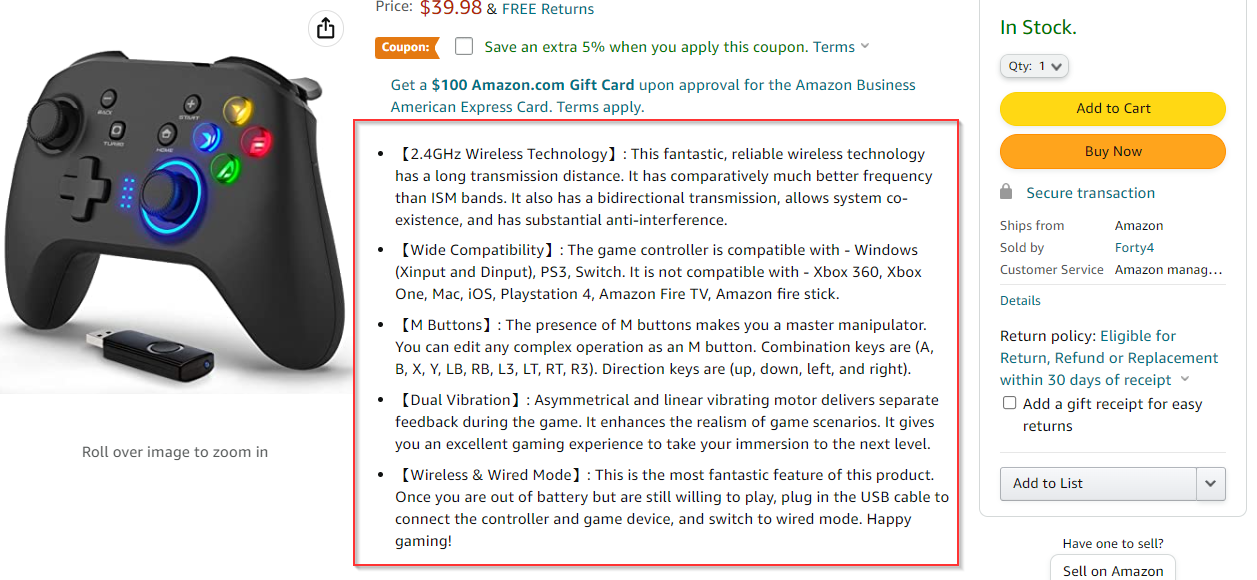
The description is in list form, and you can easily skim it in a few seconds and make sense of the key features. This is a perfect example of excellent UX.
How to Do It
Follow these best practices and proven techniques to craft product descriptions for your ecommerce stores that will improve user experience by helping them scan content:
- Write the most important information first and move details toward the end;
- Highlight important information so it stands out from the rest of the text;
- Use subheadings to distribute content into different meaningful sections;
- Keep subheadings descriptive;
- Write short sentences and paragraphs;
- Add lots of white space to improve readability;
- Add bullets and lists to make content scannable.
Insights from the Field - Product summary bullets
We have tested product bullets for numerous clients and have found them to win 90% of the time. One specific way we have helped clients justify the expense of producing these is to test the bullets on a subset of products in order to understand the conversion and revenue lift. That can then be compared to the cost of the project and an ROI can be established.
6. Personalized Product Recommendations
Personalization is the key to improving user experience.
More than 80 percent of people say they are more likely to do business with a company that offers a personalized experience, and 90 percent of people say that personalization is desirable.
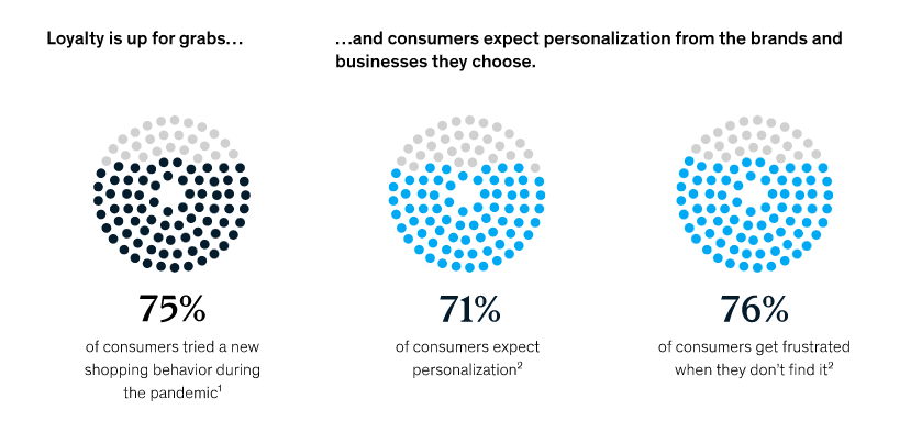
A McKinsey study found that consumers expect personalization from brands and if they don’t get it, they get frustrated and are more likely to switch. More than 67 percent of consumers reported that they want to see relevant product recommendations from brands, and 66 percent said that they want tailored messaging to their needs:
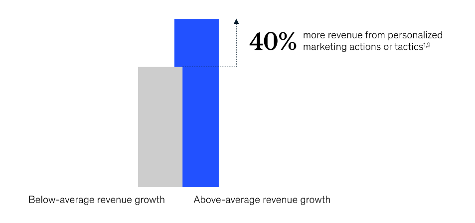
When you recommend personalized products to your customers, it doesn’t just improve user experience but increases revenue. Businesses that use personalization are more likely to earn 40 percent more revenue:
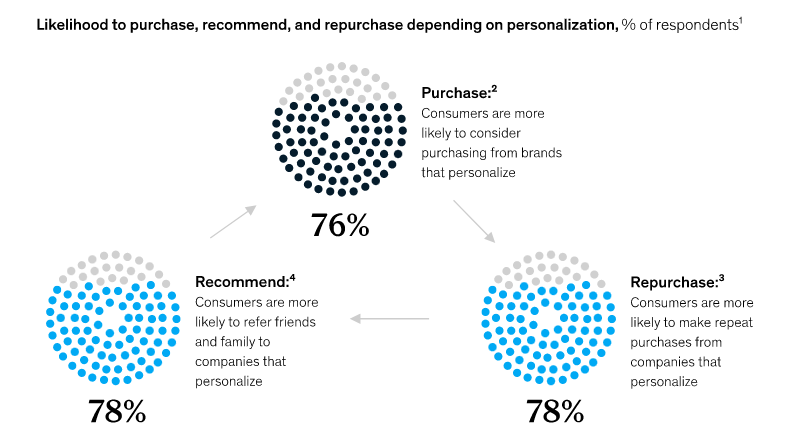
Personalized recommendations improve UX and revenue in three different ways: Purchase, recommend, and repurchase:
It is indeed the best way to generate business and convert your customers into loyal brand ambassadors. If you aren’t using a recommendation engine for your ecommerce store, you should get one. It is the best way to take UX to the next level and increase sales and revenue.
How to Do It
A recommendation engine works automatically and recommends products to customers based on key variables. There are three ways a recommendation engine works:
- Collaborative filtering uses data from multiple customers and predicts products based on common patterns and behavior.
- Content filtering uses customer’s historical data and recommends products based on each customer’s buying patterns.
- Hybrid system uses data from similar users and individual customer’s past purchases and recommends the most relevant products.
Ideally, you should use a hybrid recommendation system; it’s more thorough.
The next step is finding the right places to add recommended products. Here is a list of the best places for recommended products:
- Product page;
- Category page;
- Shopping cart;
- Email/newsletter.
Insights from the Field - Product Recommendations
This is a very fruitful testing area. We have run over 40 of these tests to optimize the parameters of placement and algorithm. Key findings are that page placement, number of elements (i.e., two recommended elements instead of 1), and ALGORITHM testing are crucial and can generate significant AOV gains.
7. Optimize Forms
You can’t run an online ecommerce store without forms. Even if you choose to offer a one-page checkout, one-click buy option, and guest checkout, you can’t go without forms.
And forms are one of the least liked elements on any webpage. Everything else might be working right and a poor form can wreck the user experience in an instant. Almost 45 percent of form data is submitted on mobile devices, which means form UX is crucial for conversions.
Expedia lost $12 million per year by an extra form field (company name) in its booking form. Yes, that’s right. Form user experience is the only thing that matters for ecommerce UX, sales, and revenue because that’s how customers pay you (by filling out a form).
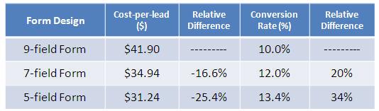
The way you design a form links to conversion rate and cost per lead. Marketo found that reducing form fields to five from nine increased conversion rate by 34 percent and reduced cost per lead by 25 percent:
Optimizing forms on your website and making them user-friendly should be your top priority because that’s where conversion happens. It isn’t just about the design of the form, but its user experience is what matters more than anything else.
How to Do It
Here is a list of the best practices to improve form design and UX to boost conversions:
- Keep the form short. Remove unnecessary fields. Ideally, you should have no more than five fields in your form for the best UX;
- Use multi-step forms; they perform better than single-step forms;
- Group form fields together based on relevance to give your form a smaller look;
- Use conditional logic to reduce form fields in real-time;
- Enable autofill and autocorrect;
- Enable copy-paste for all form fields, including passwords;
- List all the form fields in a single column;
- Use inline field labels whenever possible;
- Mark required fields to help users skip optional fields when they are in a hurry;
- Make your form mobile friendly.
Start by Identifying UX Problems
These seven best practices are just a start to a continuous journey toward a better user experience. The process should be data-driven and not subjective.
Find user experience issues your ecommerce business is currently facing such as poor form conversion rate or high website load time. Prioritize all these UX problems and address them based on their importance and impact.
Changing user experience and website functionality is not without risk. This is why an ongoing A/B testing program is essential to make sure UX changes improve conversion (or at least don’t harm it). Click here to request a free mini UX ecommerce audit and see how you can improve UX and conversions via one of our CRO programs.